Choice of Contrast and Color for Maximum Legibility in Window
A window graphic can become your best salesperson or a visual obstacle if not professionally designed. A window with confusing graphics, incorrect colors, or poor contrast can drive potential customers away instead of attracting them. Unclear or difficult-to-read messages can convey a lack of professionalism and negatively affect your brand’s image. At Mas Color Signs, we understand that visual clarity is key to capturing attention and effectively conveying a message.
Why is legibility crucial? The science behind the gaze
Legibility is a necessity backed by visual science. People often make hasty decisions about where to focus their attention based on how they visually perceive information. And in cities so saturated with visual information, factors such as color, contrast, and typography play a critical role in initial perception. Good readability allows the eye to quickly grasp the message, which translates into increasing the likelihood of conversion and message retention.
The power of contrast: making your message stand out
The appropriate contrast ensures that your message stands out clearly against any background, facilitating quick reading even from long distances or in low-light conditions. Contrast significantly increases message retention and comprehension.
Better contrast combinations
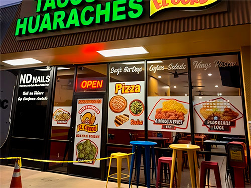
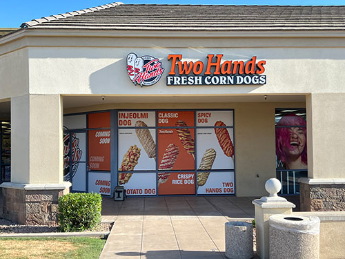
- Black on white or yellow
- Dark blue on white or cream
- Red on white
- White on dark colors, like navy blue or black
These combinations ensure that your message is visible in any environmental context or lighting. Always remember to choose colors that match your brand image to create visual consistency.
Choosing the right colors goes beyond mere contrast
Color psychology
- Blue: trust, serenity, professionalism.
- Red: urgency, passion, energy.
- Yellow: optimism, clarity, immediate attention.
- Green: freshness, tranquility, nature, health.
Choosing the right colors according to the message you want to convey will reinforce your branding and improve the overall effectiveness of the graphic.
Harmonious colors versus contrasting colors
Using harmonious colors can create a relaxing and cohesive visual impression, suitable for institutional or corporate messages. On the other hand, contrasting colors generate immediate impact and are ideal for promotions, sales, or crucial notices that require immediate attention.
Taking the environment into account
Evaluate the environment where your graphics will be placed. A window exposed to direct light or in a visually saturated area may need striking combinations, while interior or discreet locations could benefit from softer and subtler tones.
Practical tips for optimal window readability
- Use clear, sans-serif fonts with appropriate thickness.
- Avoid complex backgrounds or textures that interfere with reading.
- Conduct visual tests under different lighting conditions.
- Keep messages brief, clear, and direct.
- Consider the text size according to the usual reading distance.
The advantage of Mas Color Signs
At Mas Color Signs, we have the experience and specialized knowledge to help you choose the perfect combination of contrast and colors for your window graphics. Our team of expert designers guarantees visually striking results, ensuring maximum legibility and effectiveness in every project.
Trust us to stand out visually and clearly convey your message to your potential customers. Contact us and transform your exterior sign into a symbol of conscious and lasting identity. Call us at +1 623-297-3457.